THE TERRYS
Industry: Music / Entertainment
Role: Freelance Graphic Designer, Illustrator, Photographer.
Deliverables: Single Artwork, Merchandise Design, Motion Graphics, Logo Design, Photography.
Timeline: 2023 - ongoing.
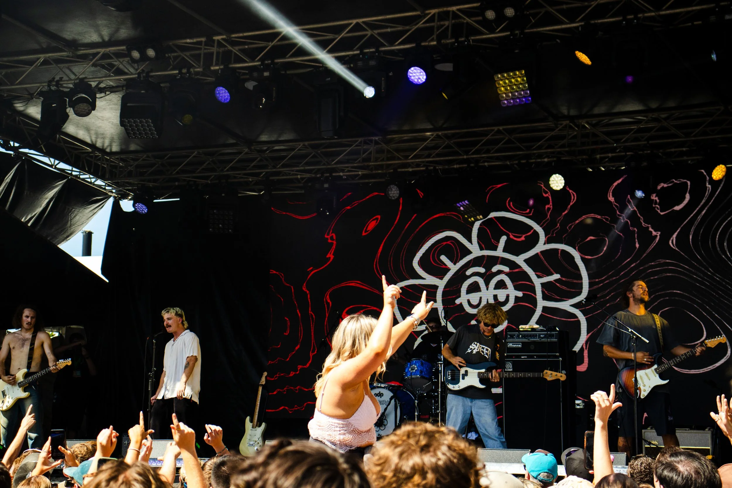
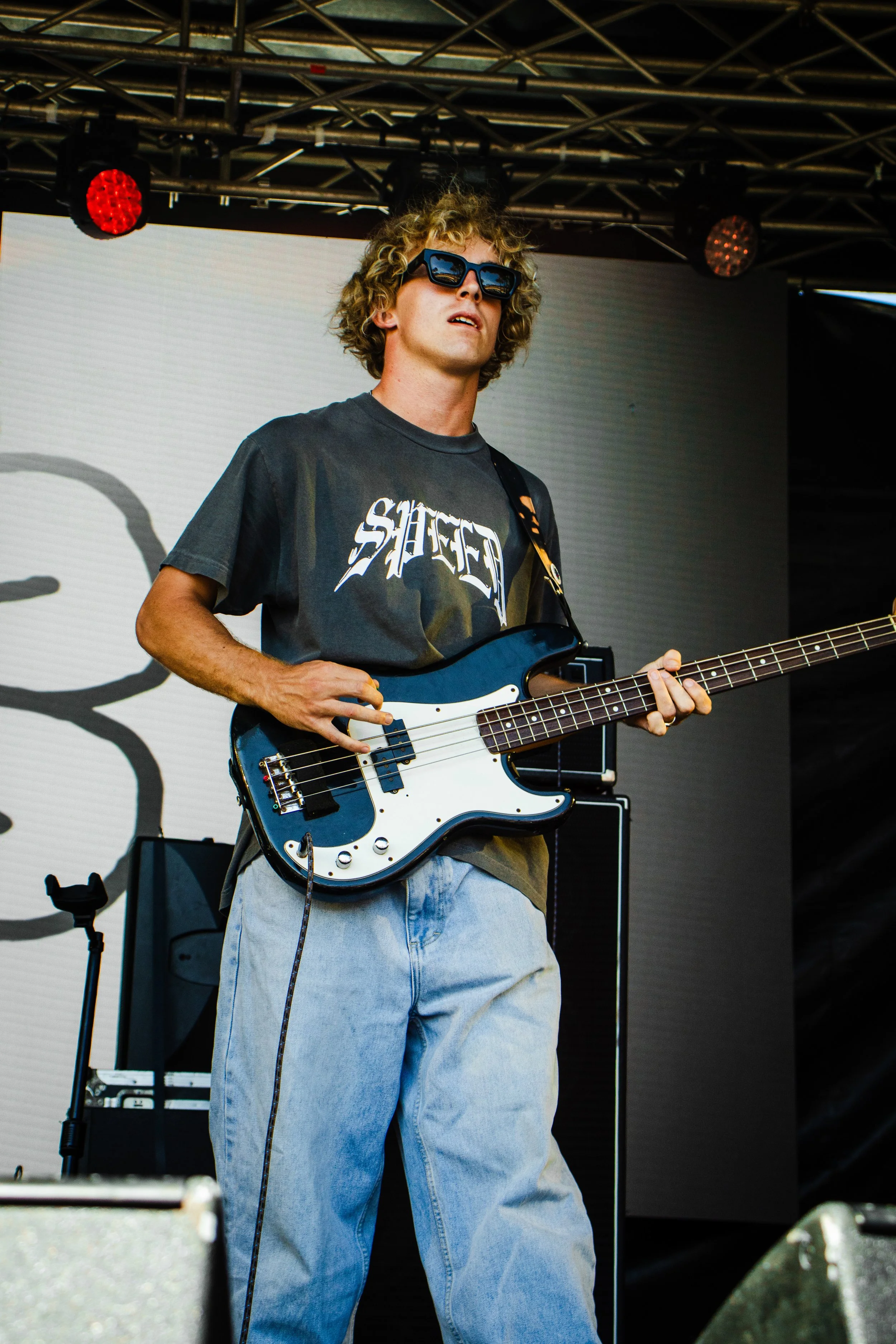
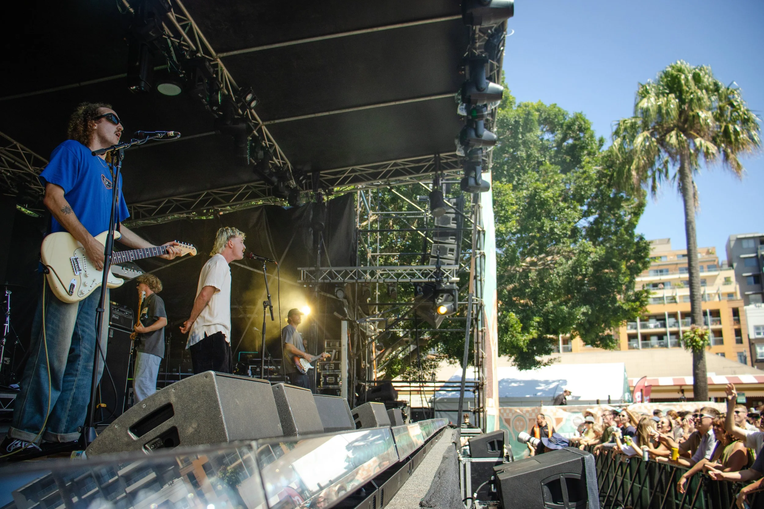
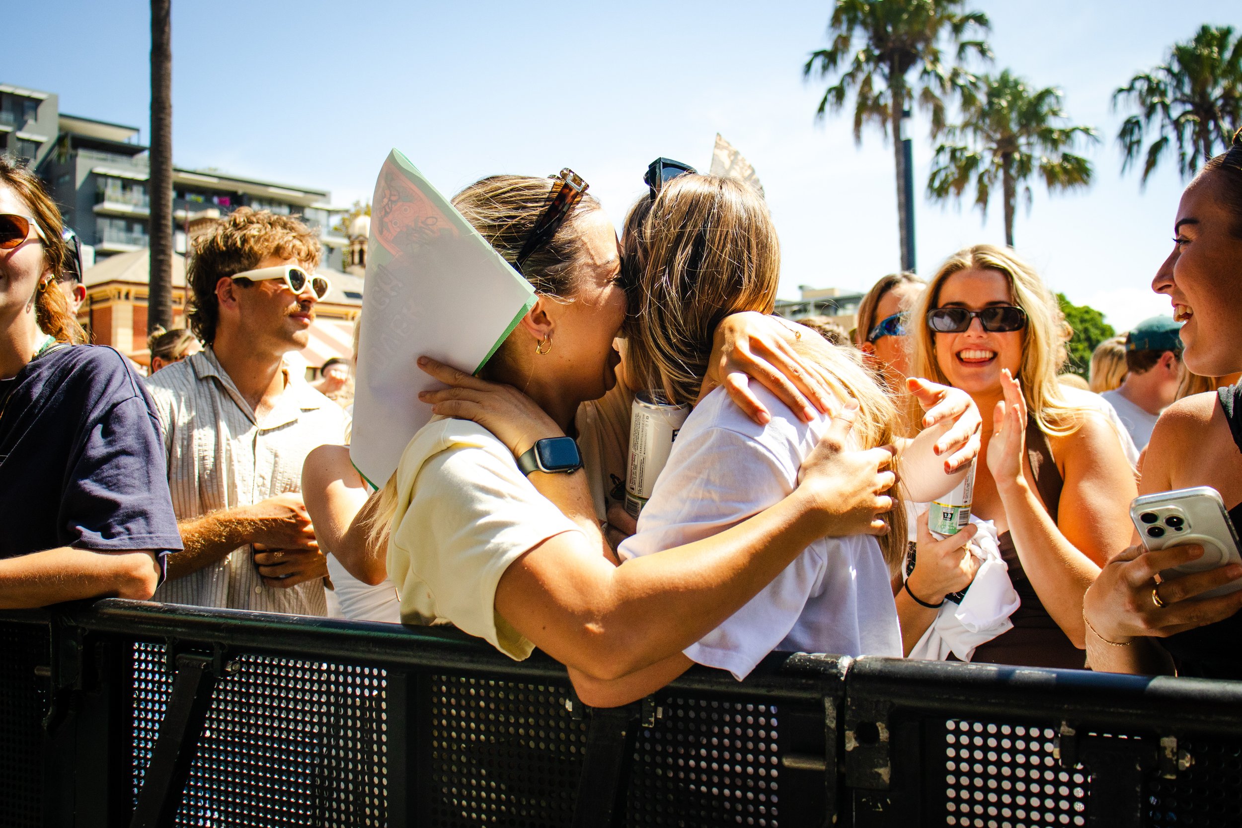
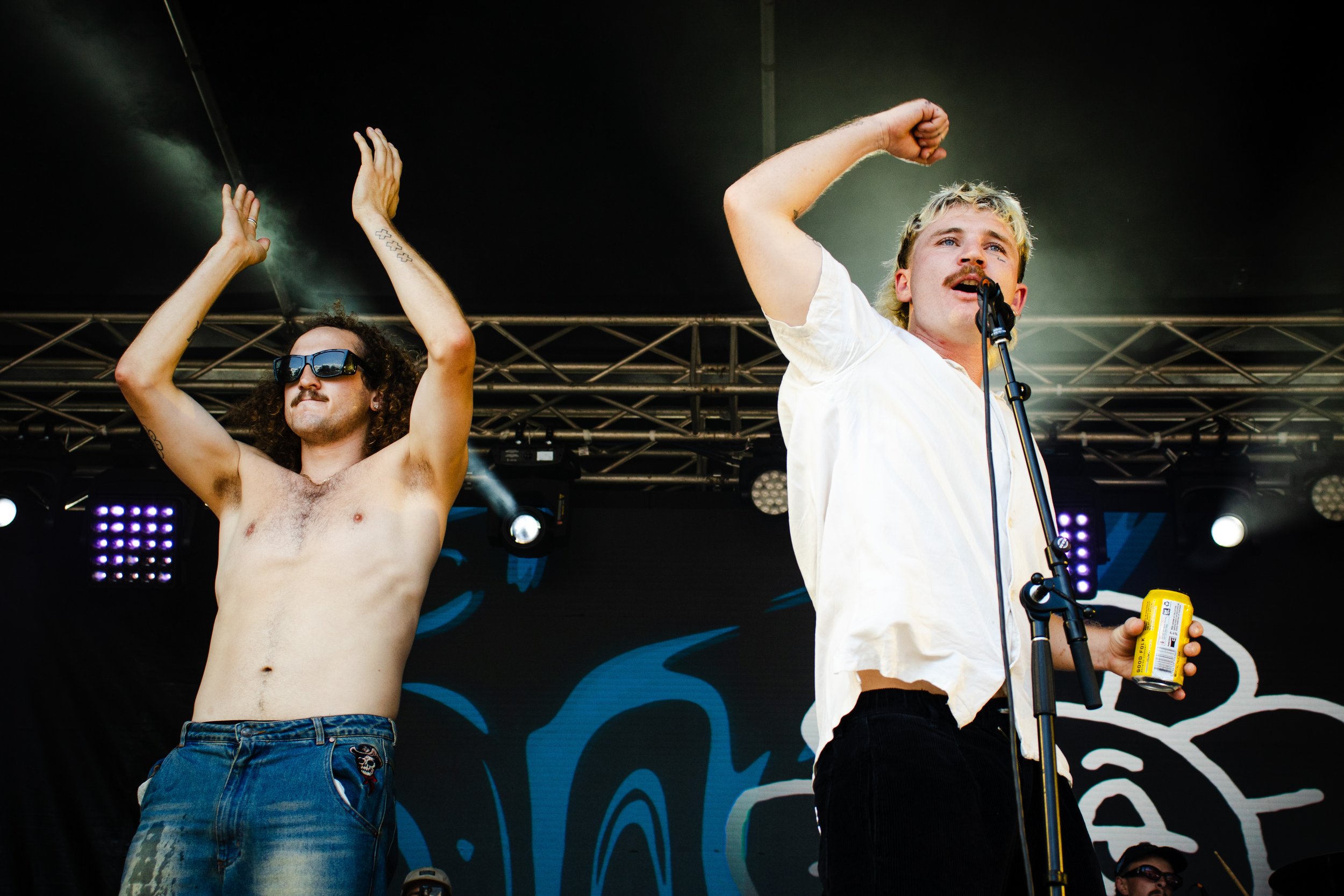
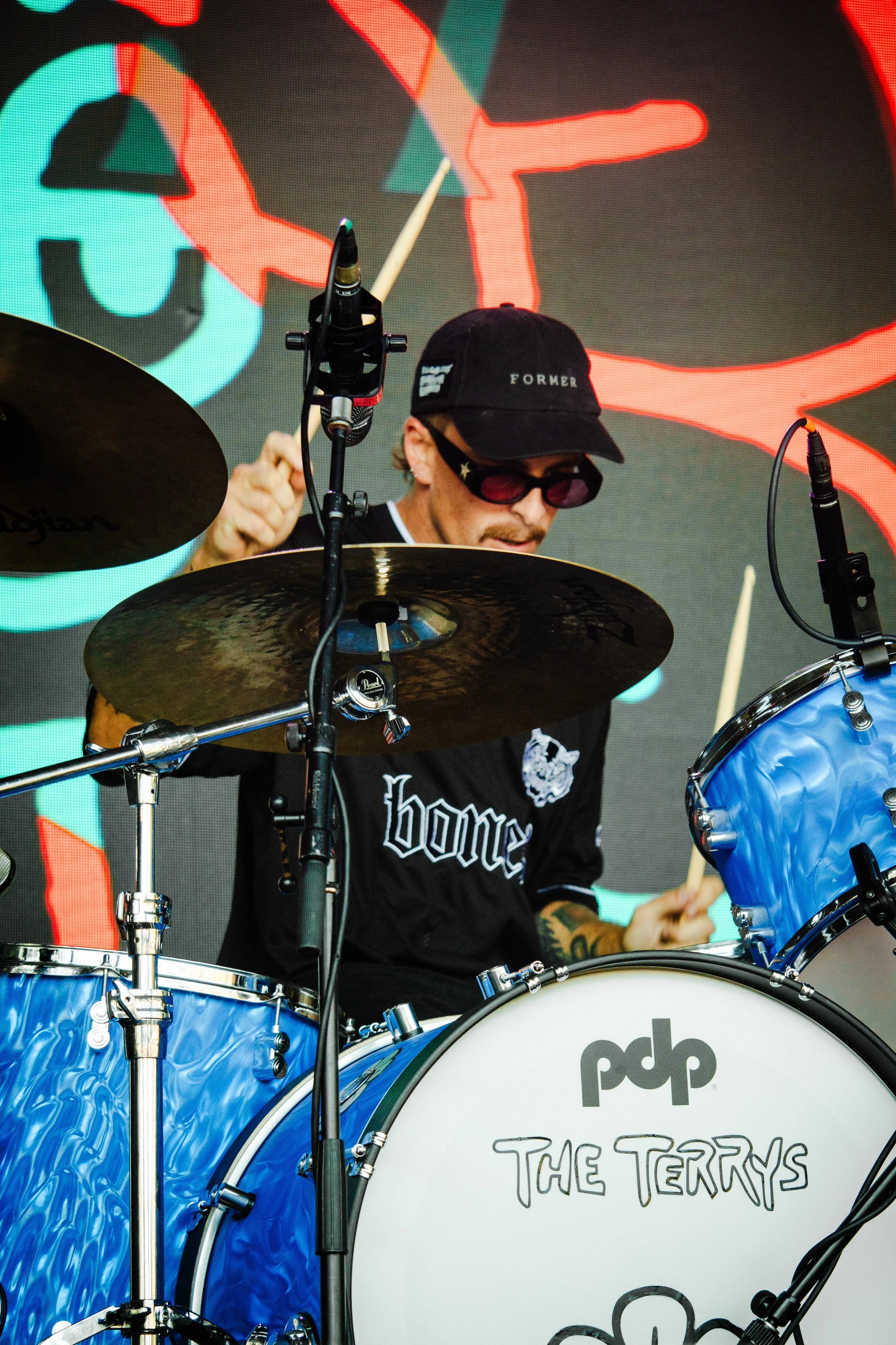
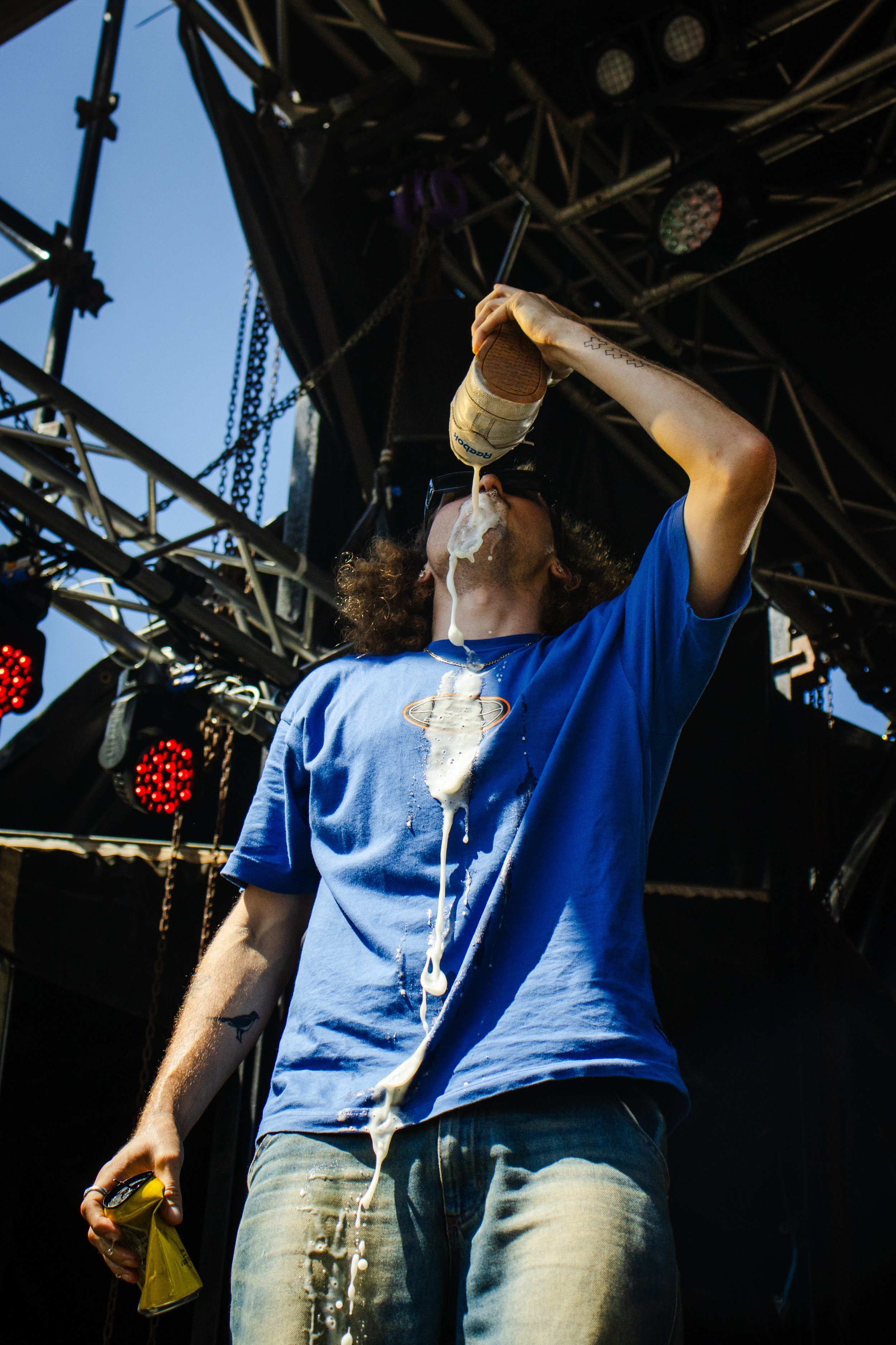
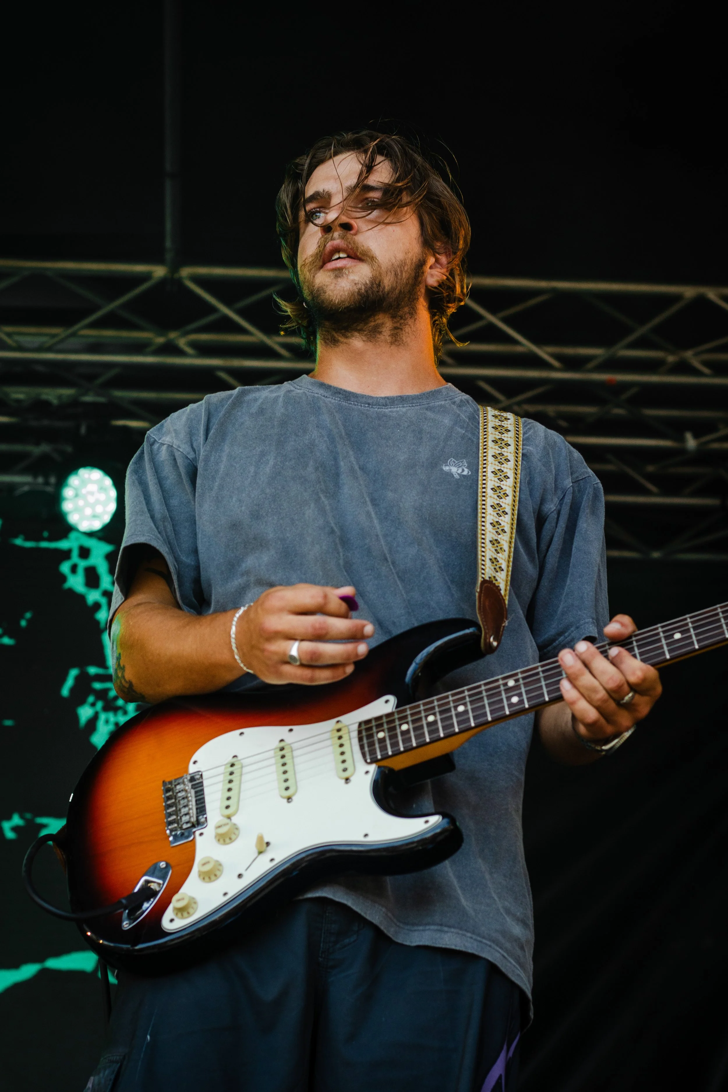
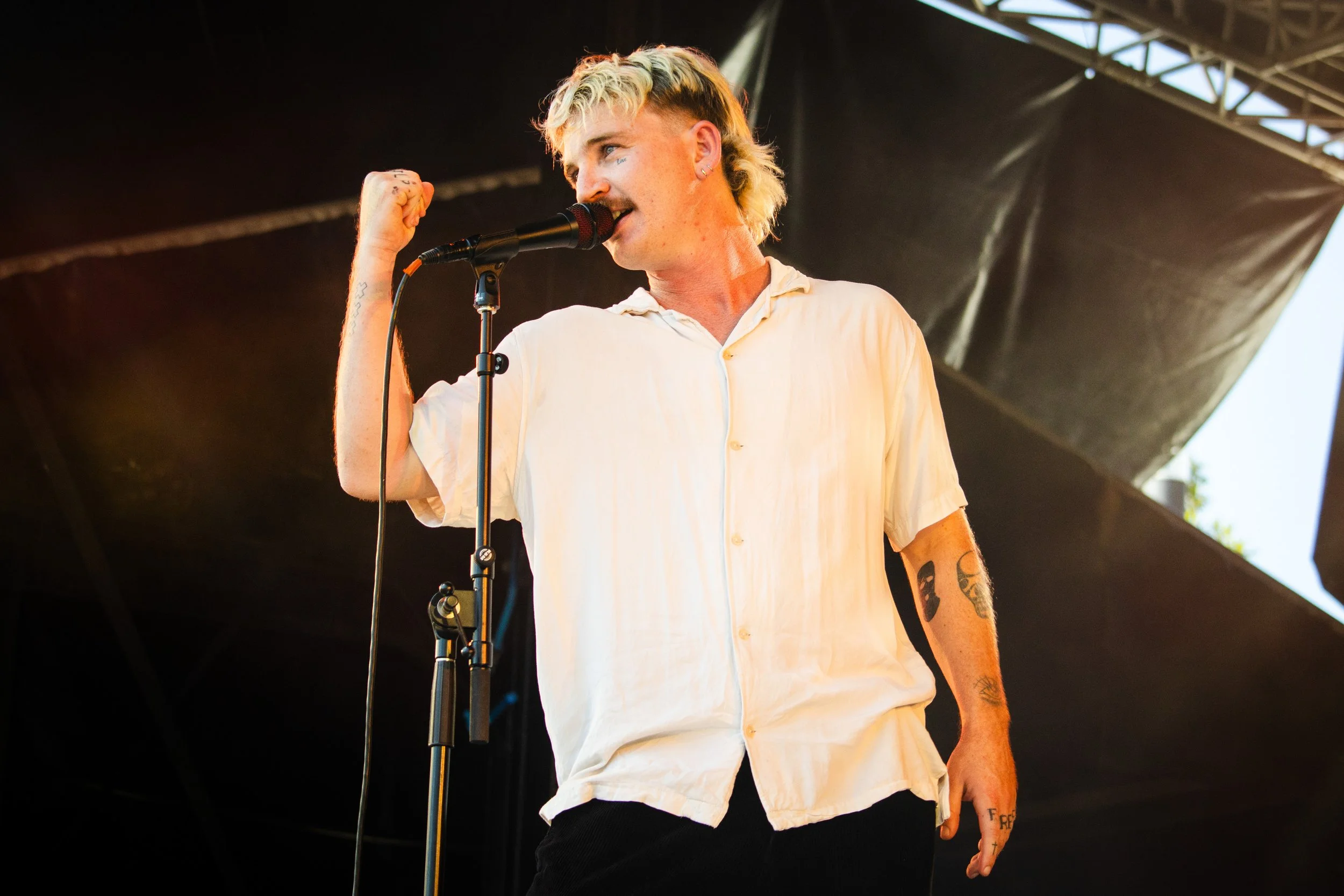
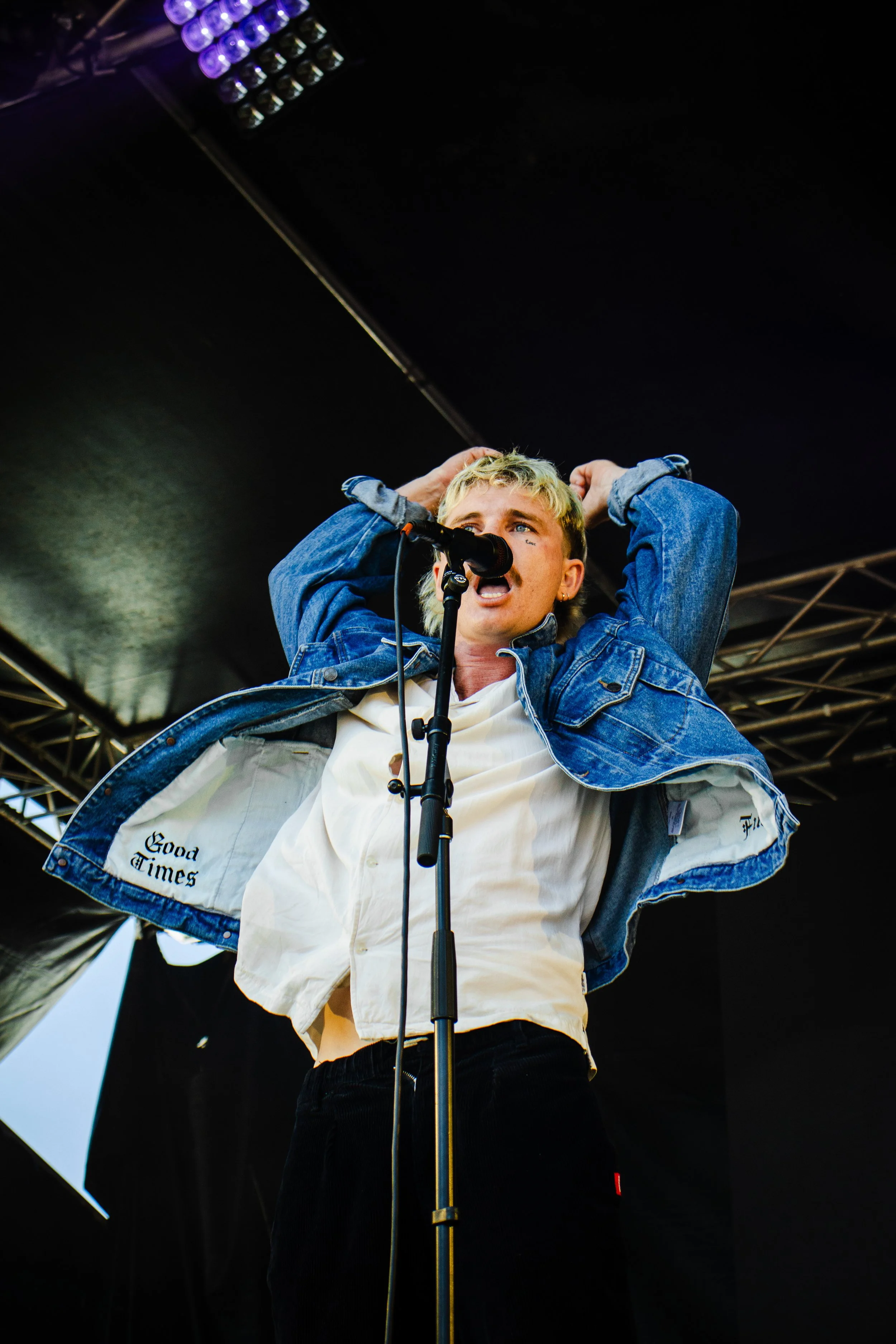
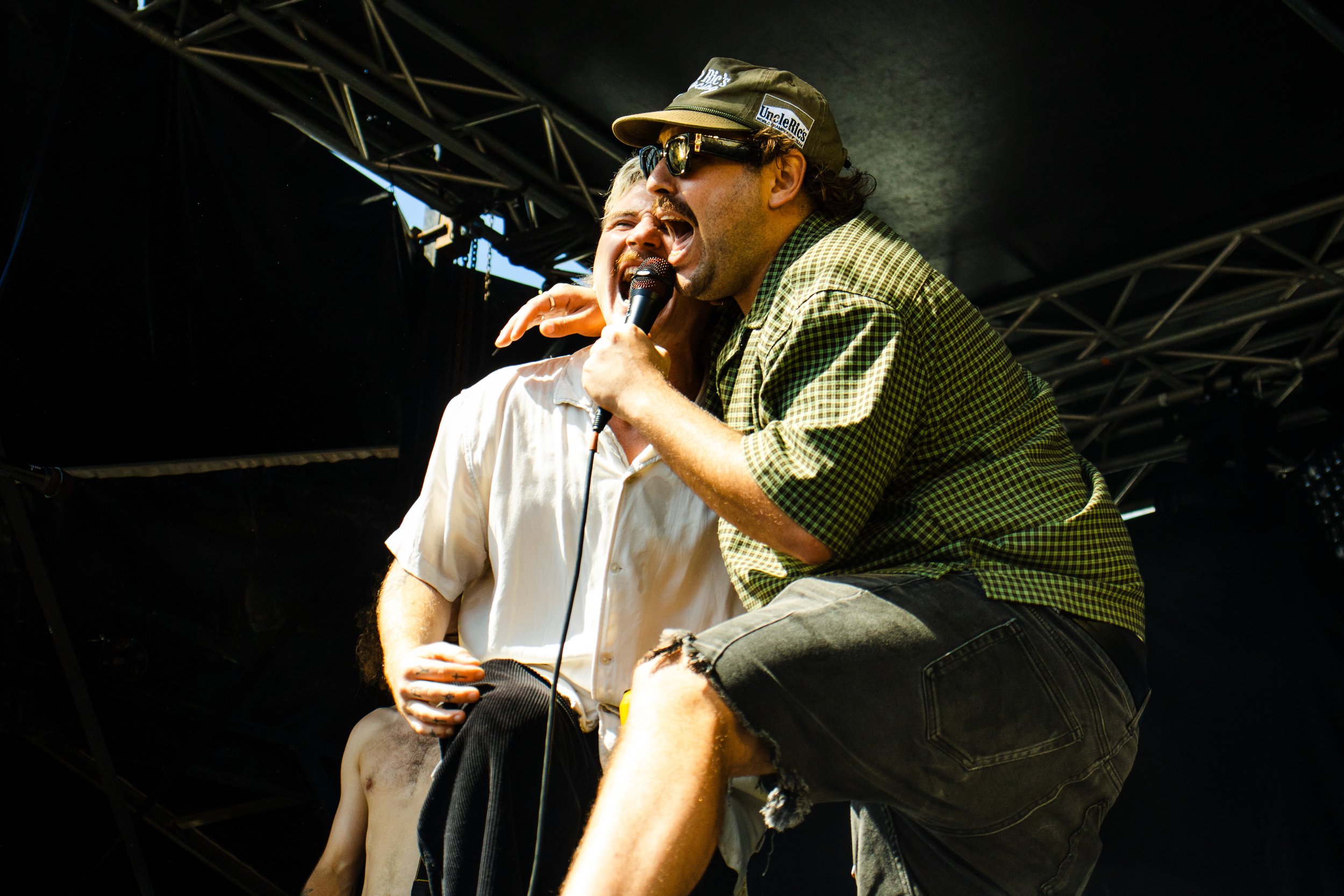
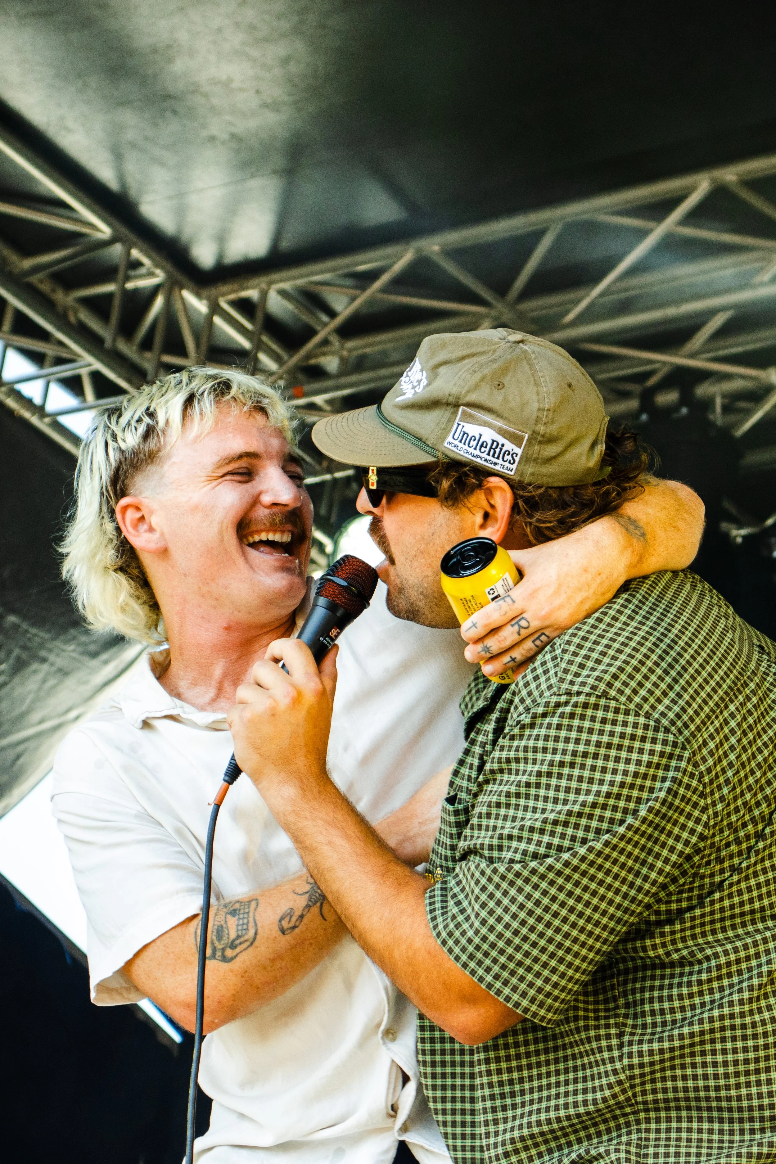
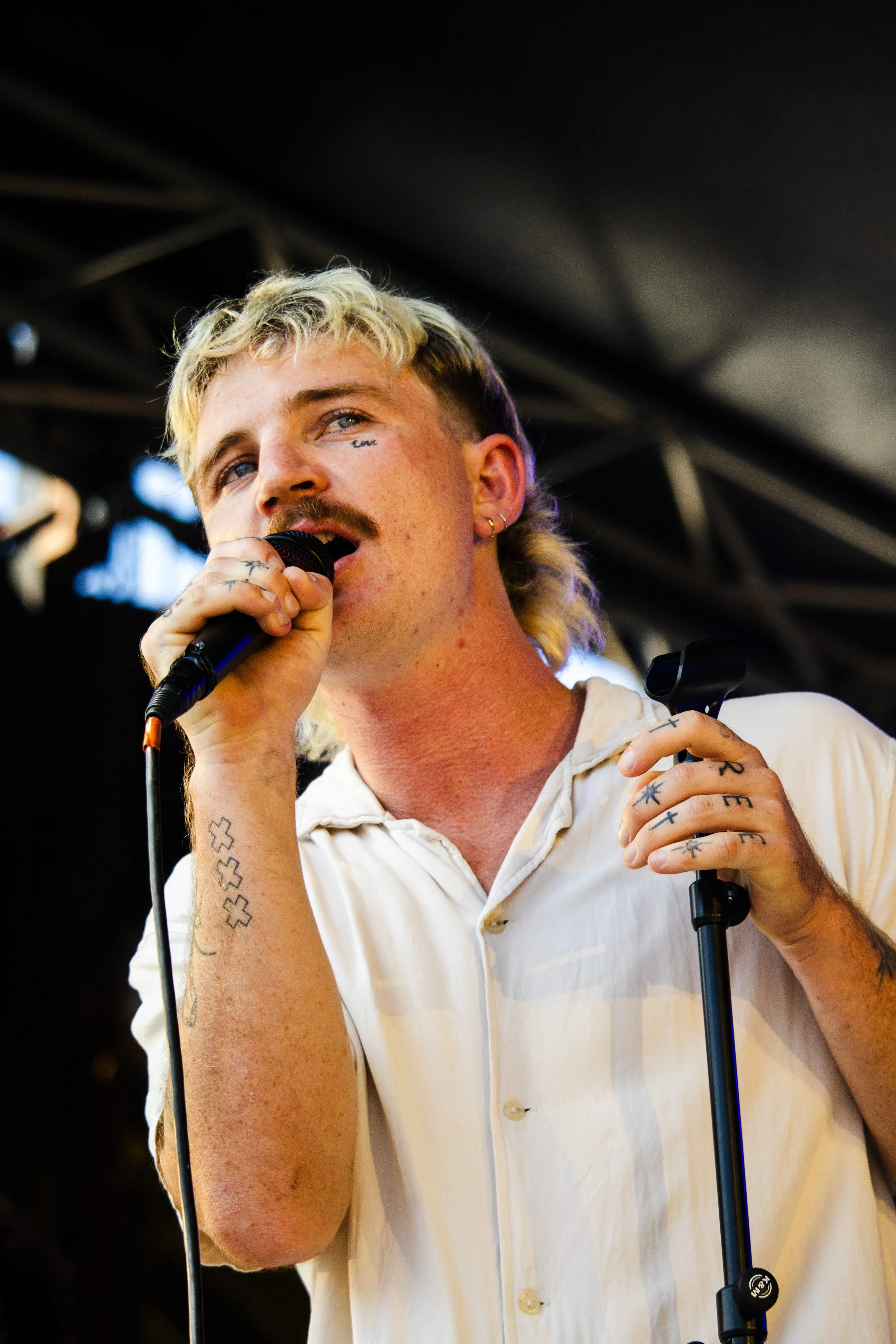
The Terrys are one of Australia's most recognisable surf-rock bands, known for their infectious energy, laid-back attitude, and distinctly Australian identity. Across an ongoing creative partnership, I have contributed to a range of visual projects including single artwork, merchandise, motion design, photography, and brand assets.
The objective has been to create work that feels authentic to the band's playful personality while maintaining the DIY spirit and creative freedom that have become synonymous with The Terrys' visual identity.
Services:
Illustration
Single Artwork Design
Merchandise Design
Motion Graphics
Logo Design
Live Music Photography
Creative Artwork
Project One: IDK
The Challenge: Create artwork for ‘IDK’ that captured the band's lighthearted personality while standing apart from traditional music artwork. The visual needed to feel handmade, memorable, and reflective of The Terrys' playful approach to creativity.
The Solution: Beginning with hand-drawn illustrations of each band member, I developed a series of character sketches that were later digitised and refined while preserving their imperfect, DIY quality. The repeated portraits created a strong visual rhythm across the artwork, giving the cover a distinctive personality while celebrating the individuality of each member. The intentionally hand-crafted aesthetic aligned closely with the band's relaxed and approachable image.
The project was later extended into an animated Spotify Canvas, bringing the illustrations to life through subtle movement and creating an additional touchpoint for listeners engaging with the track digitally. The artwork was also adapted into merchandise, most notably a custom ringer tee that translated the visual identity from screen to apparel while maintaining the playful character of the original design.

Project Two: The Terrys Flower - Logo Refresh - 2025
The Challenge: Refresh The Terrys' iconic flower logo while preserving the recognisable qualities that fans had already come to associate with the band.
The Solution: Using a process that combined analogue sketching with digital refinement, I reimagined the flower mark with a brighter, more playful summer-inspired aesthetic.
The refreshed design retained the spirit of the original while introducing cleaner forms and stronger visual versatility across both digital and live applications. The final logo was designed to function across a wide variety of touch points, from social media profiles and promotional content through to large-scale stage visuals.


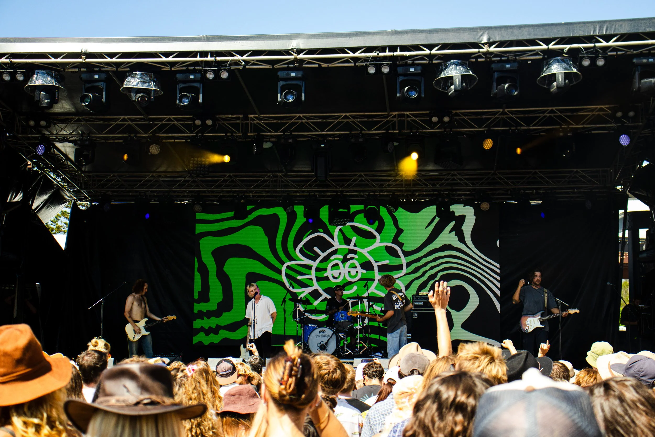
Project Three: The Terrys Flower - Logo Refresh - 2026
The Challenge: As The Terrys began moving into a new era of music, the band wanted to revisit their iconic flower logo once again. The challenge was to evolve an already recognisable asset while maintaining its familiarity, creating something that felt fresh, timeless, and reflective of the band's next chapter.
The Solution: A year after the initial logo refresh, I was invited back to develop a new interpretation of the Terrys flower mark. This time, the creative direction drew inspiration from 1970s cinema cartoons, embracing bold shapes, playful character, and a sense of nostalgic charm.
Again using a process that combined hand-drawn sketching with digital refinement, I reworked the flower into a more expressive and stylised form. The resulting design retained the recognisable qualities of the original logo while introducing a classic, timeless feel that aligned with the band's evolving sound and visual direction.
Designed primarily for digital and social media use, the refreshed logo provides a versatile brand asset that can carry The Terrys into their next era while remaining instantly recognisable to existing fans.




Results
Through a combination of illustration, motion design, merchandise, branding, and photography, this ongoing collaboration has helped strengthen The Terrys' visual identity across multiple audience touch points. Each project has been driven by the same objective: creating work that feels genuine, playful, and unmistakably The Terrys. Whether developing artwork for a single release, designing merchandise, or evolving an established brand asset, the focus has remained on building visuals that reflect the band's unique personality and strong connection with their audience.
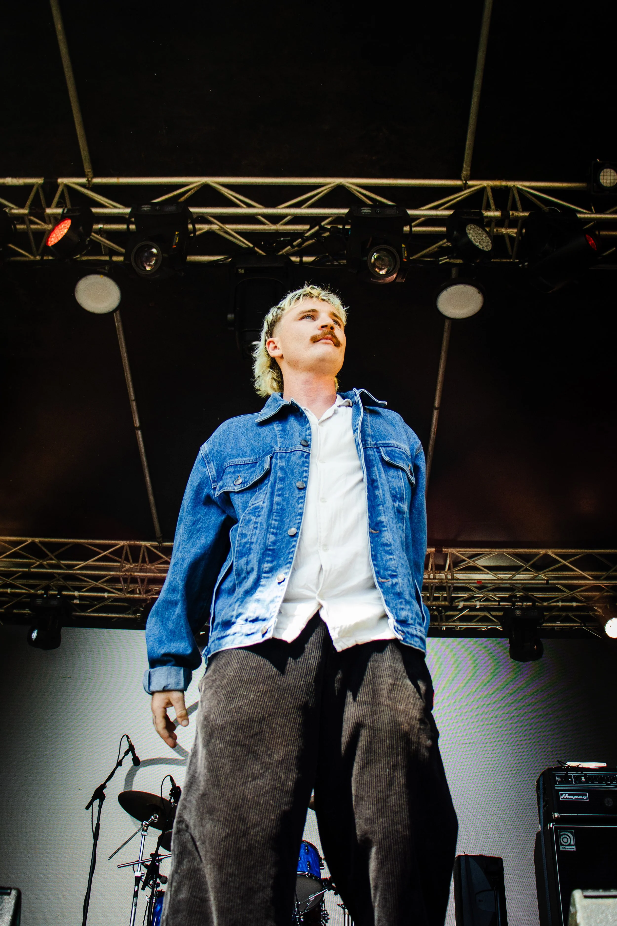
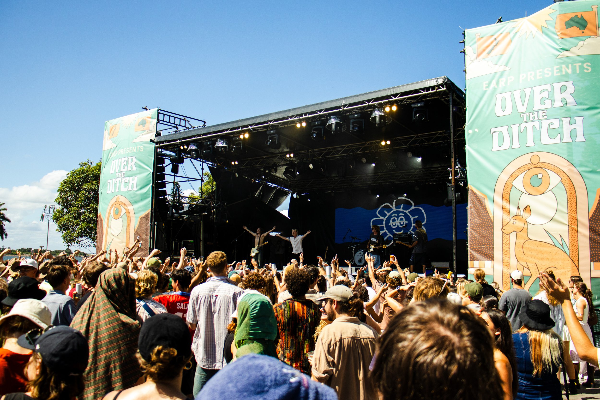
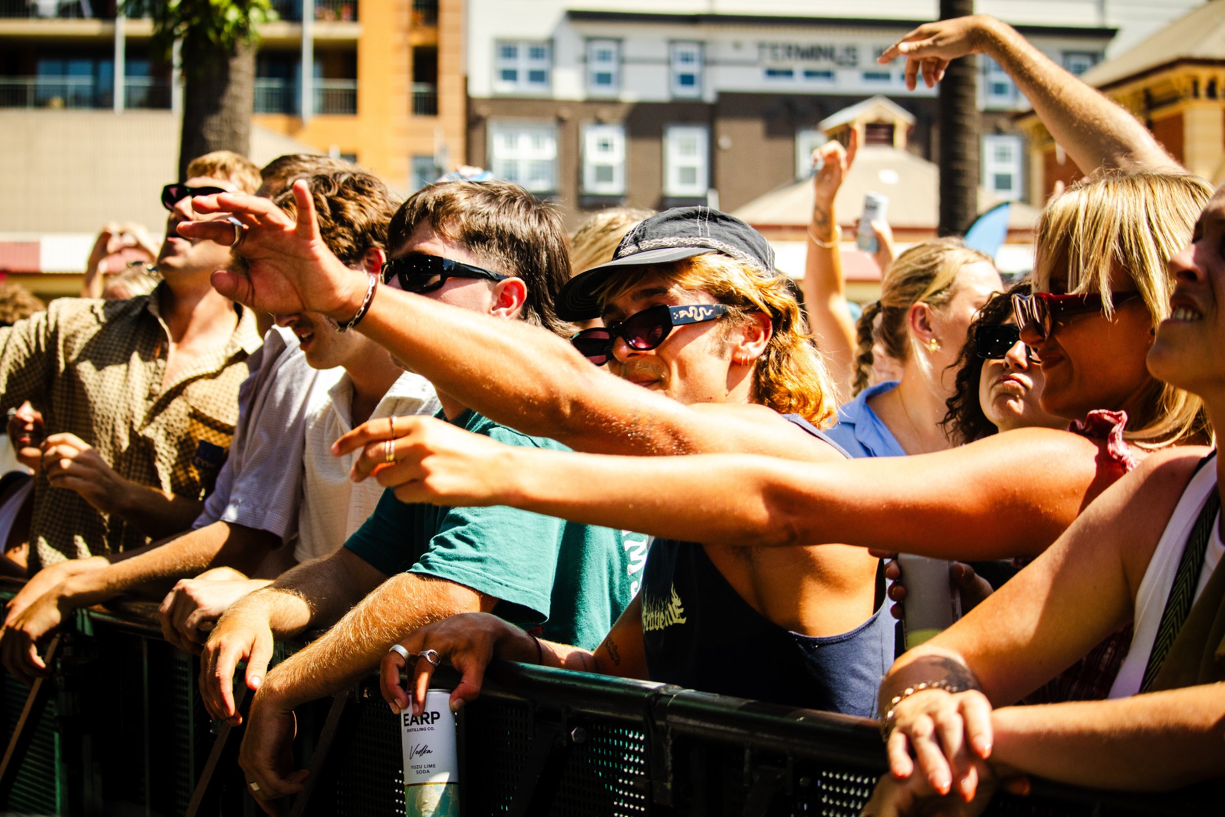
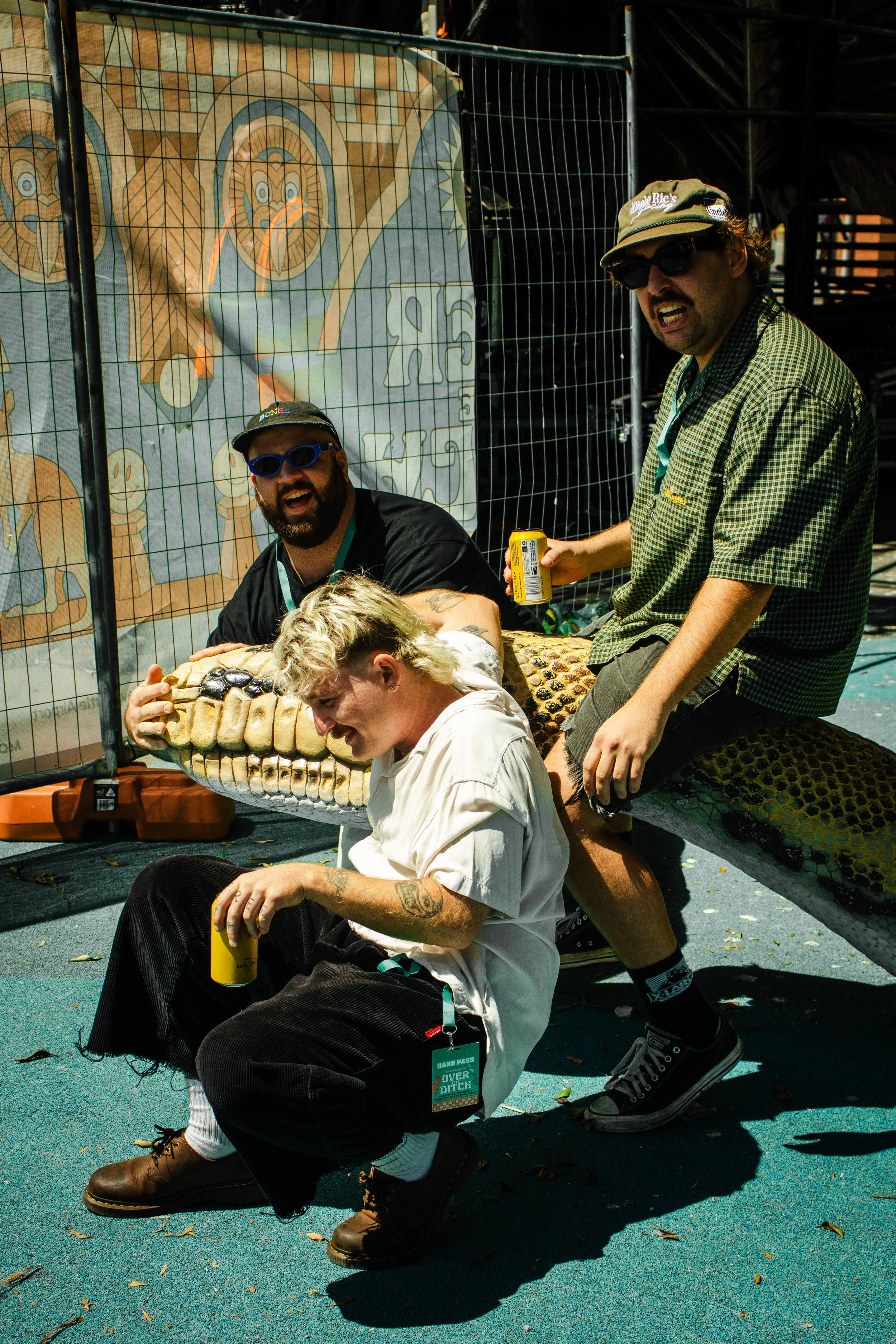
The Terrys - Over The Ditch Festival 2025